An indicator that references two specific securities

I am looking to build an indicator that references two securities.
For example,
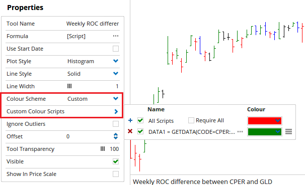
A percent rate of change, weekly for 4 time periods of CPER (US) minus percent rate of change, weekly for 4 time periods of GLD (US)
If CPER is greater than GLD, even if both are negative, this should still be a positive number.

The values could be a positive or negative number

I would like it plotted as an indicator in two ways:
1.Multi-plot shading…can these values be plotted, something like a Kuomo Cloud?
If CPER percent change is greater than GLD, then the cloud would be green; if CPER percent change is less than GLD, then the cloud would be red
The cloud would be expand/contract based on values of percent ROC minus percent ROC

  1. Green or red ribbon
    Here, there would be no values, simply…the ribbon would be green if CPER percent ROC > GLD percent ROC
    or red, if GLD percent ROC > CPER percent ROC

Also, to show how the coding is different for weekly values as opposed to daily, can I see:
ROC based on daily charts, with a ROC of 30 days?

Thanks

Hi,

There are actually two scripts that would be needed to do this. One to set the value and one to control the colour.

As we are only working with a single value (the difference between the two ROCs) a shaded ribbon does not really work well. A shaded zone usually needs two reference points, so i have used a Histogram in my example. If you were planning to have the individual ROC values as plots on the script as well as the change, a ribbon may work, what i’ve provided below should give you the foundation you need to build the display style you are after.

The script to find the ROC variation between the two codes would be:

//Set Source Codes on a Weekly Time frame
DATA1 = GETDATA(CODE=CPER:US, TIMEFRAME=1 Week) ;
DATA2 = GETDATA(CODE=GLD:US, TIMEFRAME=1 Week);
//Find 4 Week Rate of Change % for both Codes
V1 = ROC(DATA1, BARS=4) ;
V2 = ROC(DATA2, BARS=4) ;
//Plot Variation between the two ROC values
V1 - V2

Applied using a Show View, the Plot Style needs to be set to Histogram and the Colour scheme set to Custom. This will allow us to setup the second script to control the colour so that the bars are green whenever the ROC for CPER is higher than that of GLD.

//Set Source Codes on a Weekly Time frame
DATA1 = GETDATA(CODE=CPER:US, TIMEFRAME=1 Week) ;
DATA2 = GETDATA(CODE=GLD:US, TIMEFRAME=1 Week);
//Find 4 Week Rate of Change % for both Codes
V1 = ROC(DATA1, BARS=4) ;
V2 = ROC(DATA2, BARS=4) ;
//Plot Variation between the two ROC values
V1 - V2

Set the colour for this script to be green and the default colour to be red, and it will display the expected result.

Ex7

I’ve attached a workbook sample you can reference.

Regarding the time frame and ROC periods, these can be changed in the script. Time frames via the Data1 and Data2 variables, and the ROC period via the V1 and V2 variables.

Dan2.owb (14.4 KB)