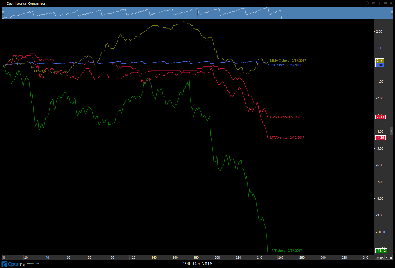
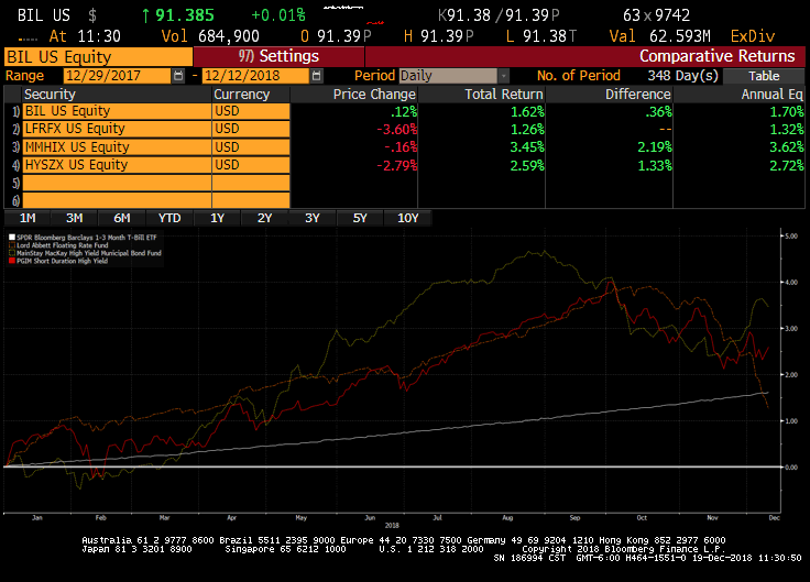
I love the historical comparison chart as it is not limited to 6 securities like Bloomberg's Comp function. However, since it is not total return performance it is misleading when comparing high dividend stocks or Fixed Income securities. Is there a way to plot total return using Bloomberg overrides or dividend information?
Hi Duke,
In Bloomberg, would you use a field like EQY_TRR_PCT_YTD to get the total return year to date? or EQY_TRR_PCT_1YR for the rolling 1 year total return?
If so, you can add those as External Data Fields in the Data menu.
Then you can create a Script Chart (New -> Multi-Code -> Script Chart).
Add the securities in the same way.
Change the script to DATAFIELD(FIELD=EQY_TRR_PCT_YTD)
That should work.
I can’t test that right now because my Optuma is in pieces while I am working on it, but that should get you what you are after.
Let us know how you go.
All the best
Mathew