Hello everyone,
I am new to this community.
I am an fx trader who has been finally finding his edge after seven long years.
I am preparing for my CMT Level 1 exam and getting to try some of the Optuma resources, including
the charting software on the trial package.
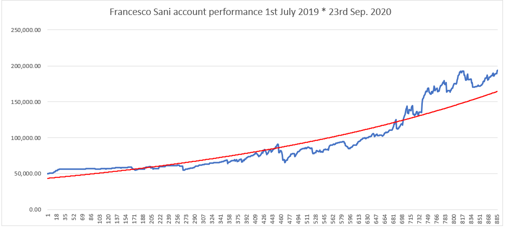
Here is my question: my trading from July 2019 to today yielded a +288.46% P/L, which seems to suggest a
Sharpe ratio of 199.56%…
This is impressive but I would like to try digging deeper… Is there any simple way (ha!) to make this info
transfer over to Optuma? The charting on Excel is pretty limited and you certainly cannot do a lot of the
charting manipulations that you would on a charting software…
I think that having a proper chart of my own equity curve and comparing it to, for example, a EUR/USD chart
(pretty much the instrument that I traded the most) could show some interesting correlations that I already intuitively
know, e.g. flat-stagnant periods in EUR/USD spot coinciding with me getting some chop and taking an equity dip…
Anyway, if you think that there is an easy way (I am not a mathematician/coder) to get my Excel data over into an Optuma
chart then I would love to know.
Sorry if it is lazy of me to just post this question, it is busy enough with the CMT revision and I need to focus on that.
Thanks a million and RESPECT to Matthew for what he and his team have set up here.
Cheers
Francesco, Scotland, UK
PS: attached is a picture of my Excel line chart with a 100-day moving average for my account P/L… This is pretty much all I can do with this chart, i.e. look at it rather than quickly work on it as a TA would in a charting software.