Hi, I was reading CMT 3 book and the Gold chapter talks about calculating leading and lagging correlations between markets.
Example: market X leads/lags market Y by n amount of days…
Wondering if Optuma might consider something like this?
Jeff
Hi, I was reading CMT 3 book and the Gold chapter talks about calculating leading and lagging correlations between markets.
Example: market X leads/lags market Y by n amount of days…
Wondering if Optuma might consider something like this?
Jeff
Hi Jeff,
I’ve thought a lot about this since doing the courses. I’ve always come back to the question of how to display the results. One way is a variation of the Correlation Grid. The other is like the way we display Autocorrelation - but that causes confusion as it is a display which is independent of the data which is above it.
I’ll make some time to review this in the new year.
All the best
Mathew
Hi Jeff,
I just wanted to let you know that Optuma 1.6 will have a Cross Correlation tool.

Hi Mathew,
Wonderful. Looking forward to the new update; thank you for adding this!
Jeff
Dear Matthew or Jeffrey, can you please advice, how to interpret the cross correlation graph in blue bars in the pic above?
Thank you,
Max
Hi Maksim,
Have a look at our knowledge base (https://help.optuma.com/kb/faq.php?id=1159)
The long vertical line is no offset. One period to the left is an offset (lagging) of 1. Two periods to the left would be lagging 2.
If we saw a correlation value of 1 five periods to the right then we can see that the second security is a leading indicator.
All the best
Mathew
Hi Mathew,
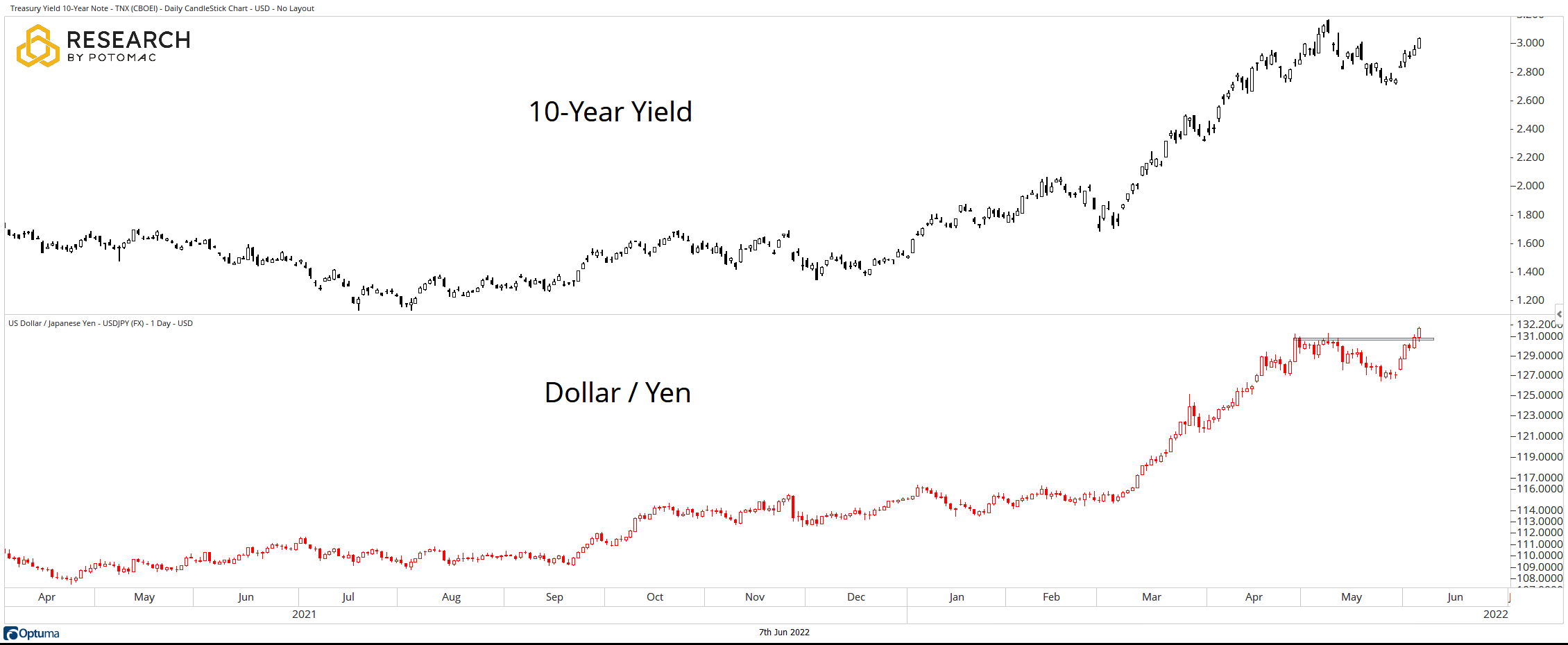
What a great tool. Please see picture 1 attached. This is a chart from Dan Russo saying USDJPY has broken to new highs and so the 10-year US Treasury yield should follow. I want to know how probable this actually is.
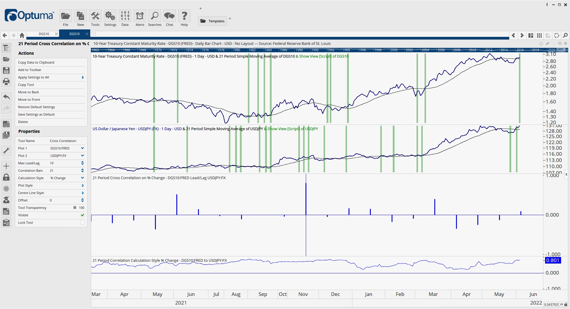
Please see picture 2 which shows a positive correlation of varying strength. A Show View tool is highlighting when the 21 simple ma turns up. Visually it looks as if sometimes USDJPY does lead.
I did look at the knowledge base, but I am still at a loss. How do I interpret the Cross Correlation tool and demine what is leading? What does the max lead/lag setting do? What is this tool saying about Russo’s visual observation USDJPY leading the 10y UST?
many, many thanks.
Hi Louis,
The max lead lag determines how much we will offset the second data set looking for correlations. See the green arrow below.
A reasonably good result is the red arrow. It looks to be a correlation of 0.6 so moderate correlation. That tells us that 10Yr is lagging around 6 days after JPY.

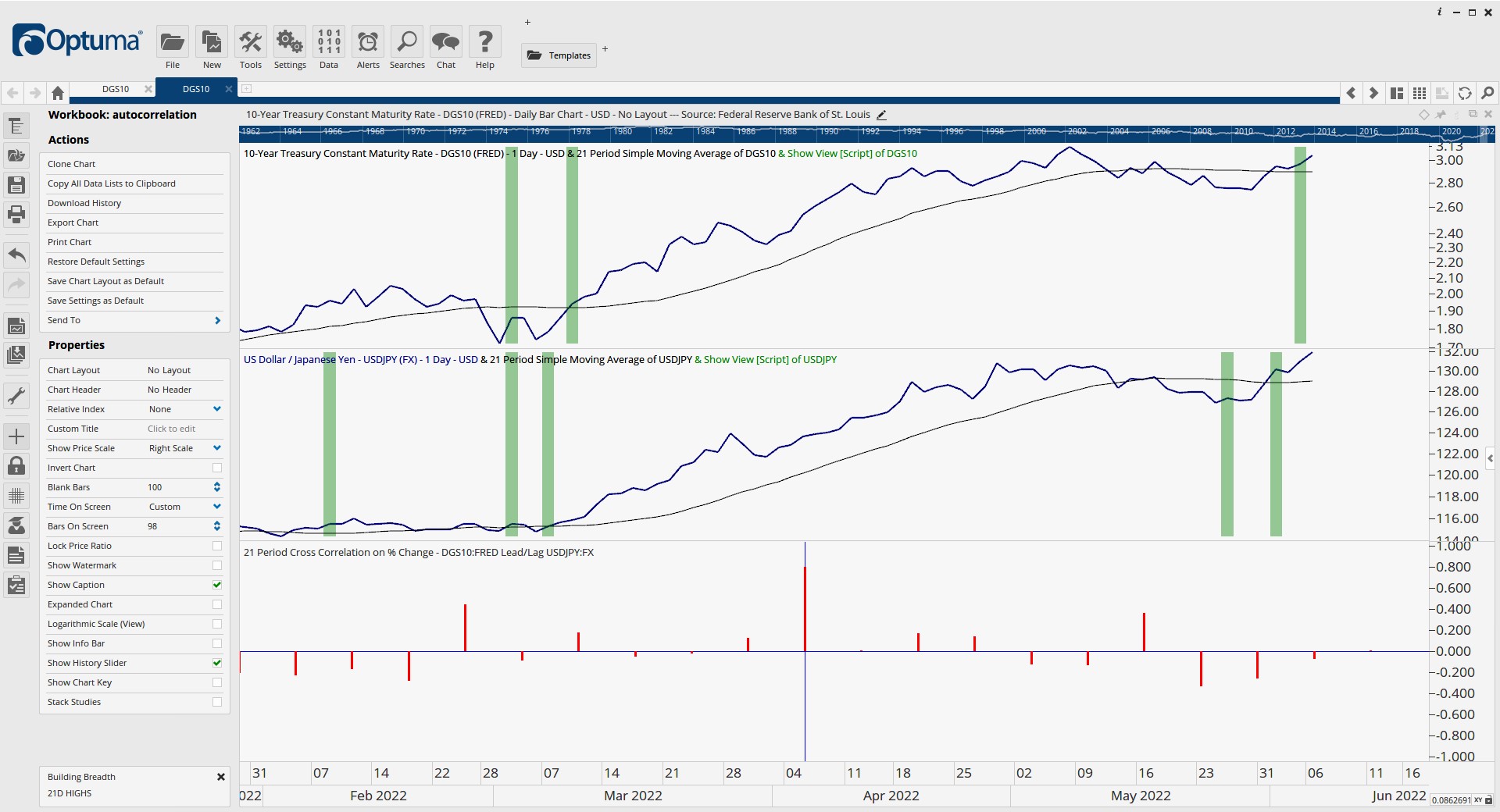
Thank you for responding so quickly Mathew. I have attached a picture that is up to date for today’s close. Please tell me if I am interpreting this correctly:
Based on a 21 day lookback, today’s correlation was strong at around .8. Over the last 10 days, still using a 21-day lookback, the correlation has been very low ranging from -0.2 to +0.2. 7 days ago when the correlation was between .4 and .5 we had a moderate correlation for that one bar. In this 10-day window, using a 21-day lookback, only 2 of the bars showed a sold positive correlation. I conclude that since the bars are not consistently strong that the probability of USDJPY being a leading indictor for the 10-y yield is pretty low. Is that how you would interpret this?
I see you have a lot more bars on the example you posted above, so have you found it best to adjust the lead/lag to any specific number when using this tool?
How to read the bars to the right of today work?
thank you for your time explaining this.