Hi,
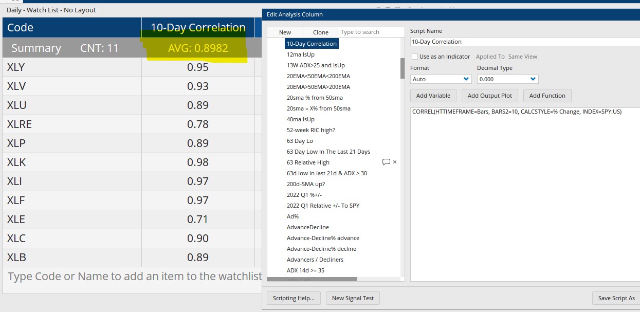
I have a watchlist of the 11 S&P 500 sectors. I have a scripted column calculating the 10-day correlation to SPY.
CORREL(HTTIMEFRAME=Bars, BARS2=10, CALCSTYLE=% Change, INDEX=SPY:US)
Above this column, I have a summary row showing the average. Please see picture 1. That average value, highlighted in yellow, is what I want to plot on a daily basis as a tool under a chart.
I have tried a few things, including the following, which did not work:
//Calculate the sector correlations
V1 = ISTICKER(CODE=XLRE:US) ;
C1 = CORREL(V1, HTTIMEFRAME=Bars, BARS2=10, CALCSTYLE=% Change, INDEX=SPY:US);
V2 = ISTICKER(CODE=XLY:US) ;
C2 = CORREL(V2, HTTIMEFRAME=Bars, BARS2=10, CALCSTYLE=% Change, INDEX=SPY:US);
//Calculate the average of the sector correlations
(C1 + C2) /2
Thank you.