I would like to be able to set parameters for the overlay tool ‘between two dates’ rather than just ‘from a certain date’? I want to be able to truncate a portion of the market movement and just overlay it, rather than the entire market line. I find that if I have a few overlays on one chart it quickly gets very crowded and hard to manage.
No problems. I have taken a couple of screenshots with one of the images manipulated so you can see.
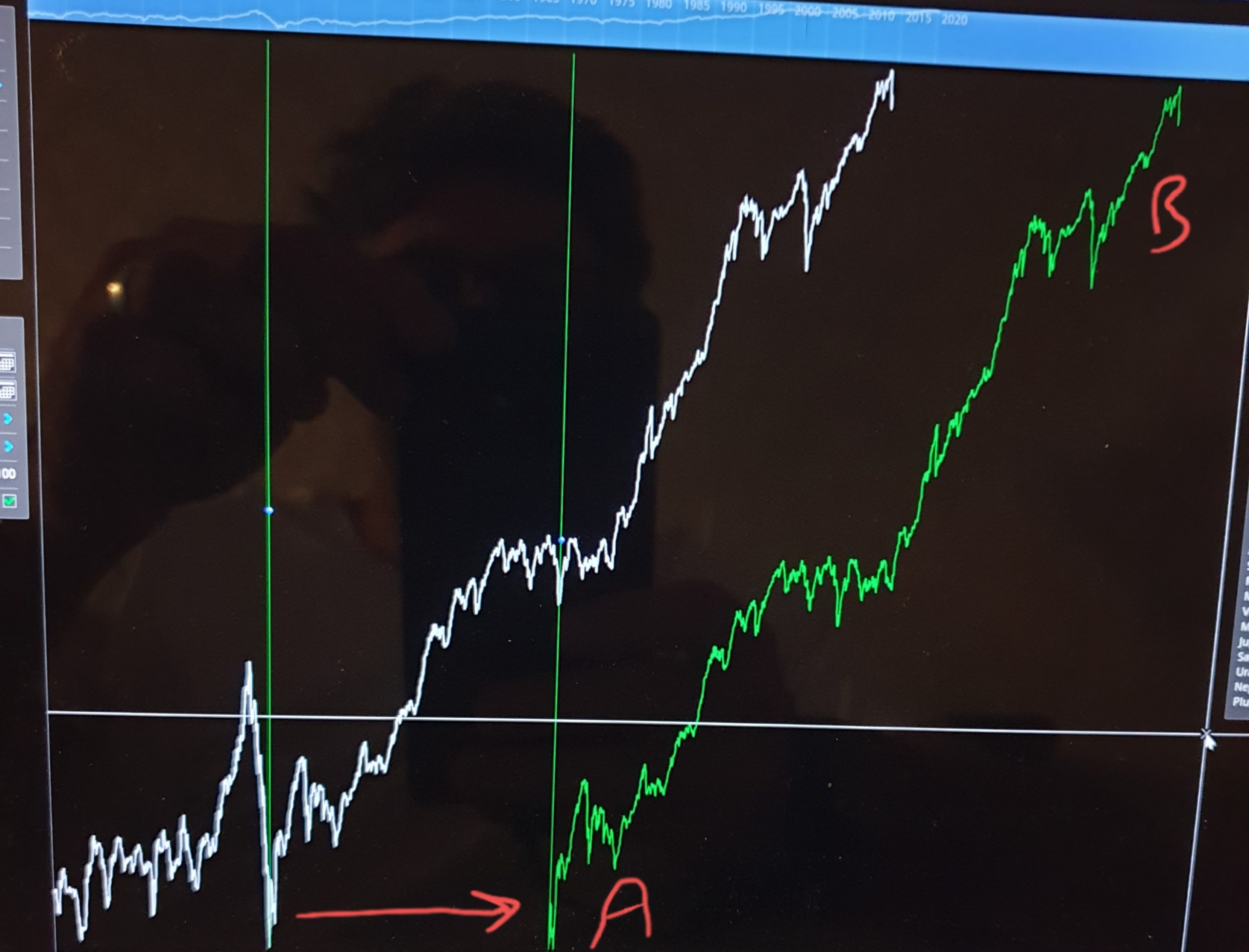
The first photo shows the overlay line AB which starts from the major low 1932-2020 in the DJI and has been overlayed 30 years in future (from 1970 low). You can see that I have ALL of the market action 1932-2020 overlayed beginning 1970 as have no choice but to do that because I can’t truncate it. What do I do if I only want to overlay a portion of the market overlay not all of it?
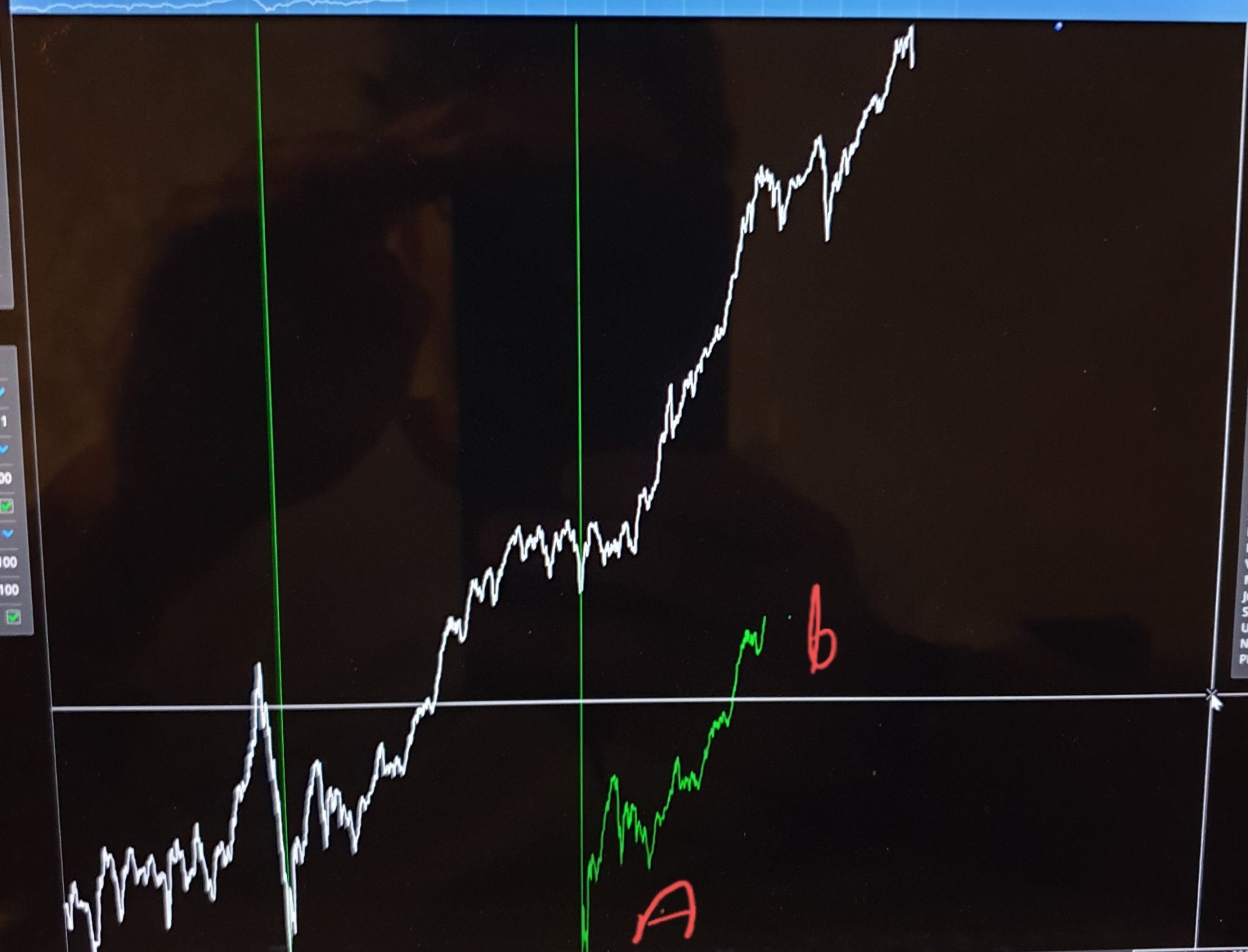
In the second pic you can see what I am trying to achieve. I have truncated the overlay line Ab, so that I am only overlaying a portion of it 1932-1958 from the 1970 Low.
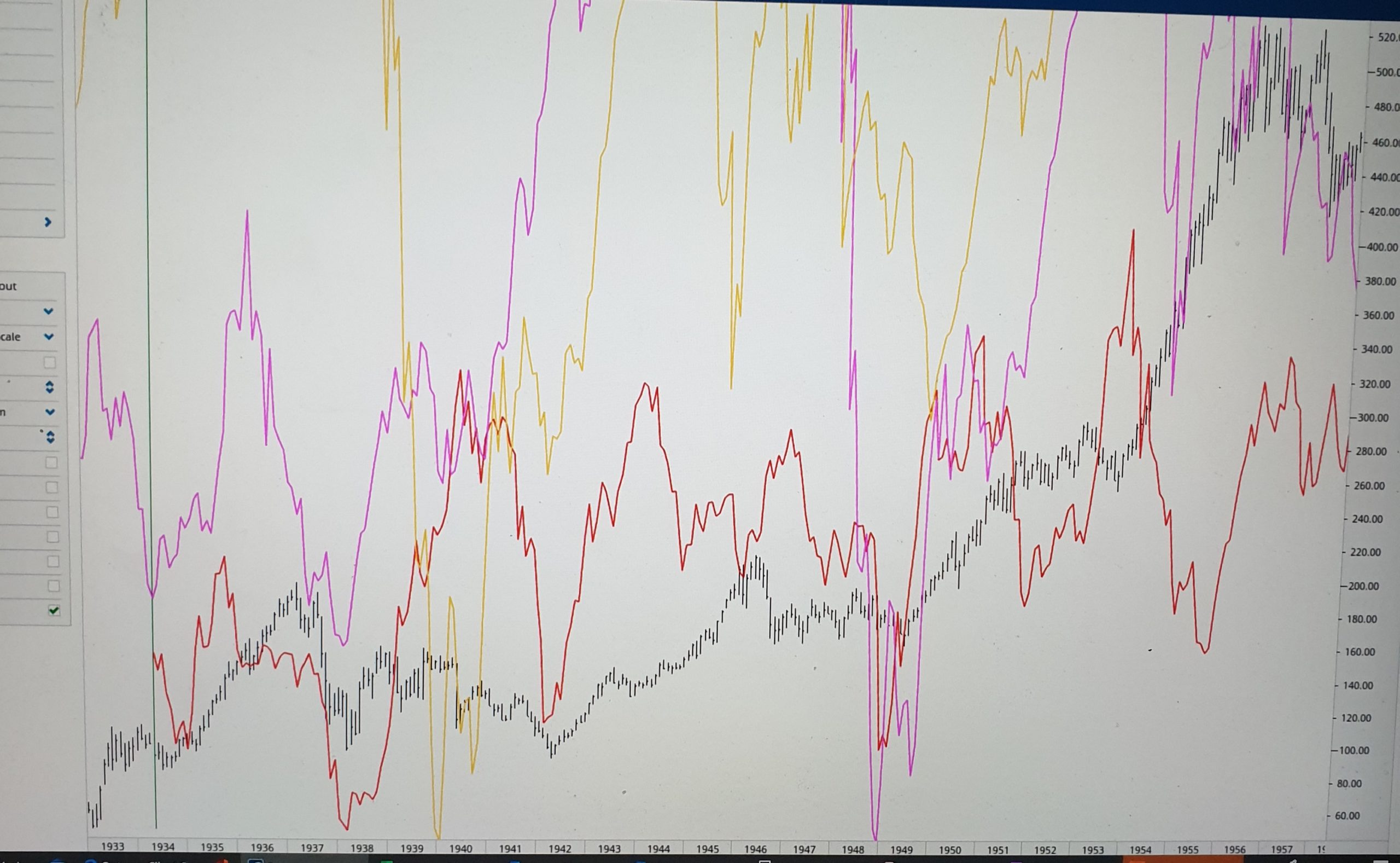
So, I would like the ability to shorten the overlay line based on a choice of two dates e.g. 1932-1958, instead of the default which does not currently allow that. You can also see that if I have several overlays from previous dates that it gets very crowded on the chart (pic 3). Truncating the overlays to a portion helps alleviate that and reflects the fact that I might only be interested in overlaying a portion of the market line not all of it.
This seems to be very similar to what the Historical Comparison chart does. Can you please have a look at this page and see if it will do what you need.
Thankyou Mathew. I had a look at the historical comparison chart. I can see what you mean, it does provide that functionality.
I guess the limitation (for me at least) is that I can’t use that functionality as a tool on the main workspace - I have to use it in a separate chart space, which isn’t as intuitive and doesn’t have some of the other features of a normal workspace and the broader context that provides.
The overlay tool is perfect for the job, but just lacks the ability to truncate it as I outlined. I appreciate that this is my idiosyncratic approach to the analysis and may not be a concern for others. I appreciate your consideration.