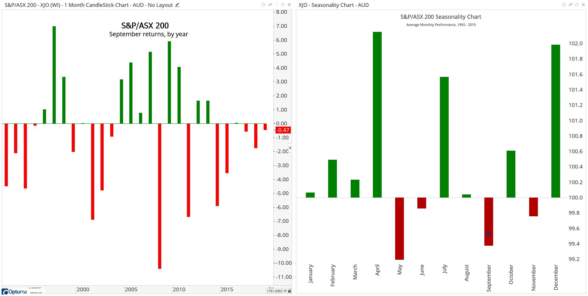
Attached is a workbook containing charts for the ASX200 index, SPX, FTSE, DAX, NIFTY, Shanghai and Nikkei showing average performance each month. The chart on the left shows the change for a specified month each year - in this example September.
You can change to your own charts, or right-click on the page tab and select Clone Page to make a copy and keep the original.
Note - the blue diamond on the Seasonality Chart on the right is the current value.
It’s created using a Show View under a monthly chart changed to a histogram, and then the price chart itself is hidden in the Structure Panel so only the histogram is displayed.
For September, the formula used is as follows:
//Choose the month;
M1 = MONTHNUM() == 9;
//Calculate the monthly change;
M2 = CHANGE(INT_TYPE=Month);
//If M1 is true plot M2, else plot 0;
IF(M1 == 1,M2,0)
Change the MONTHNUM() value in Line 3 for the required month.
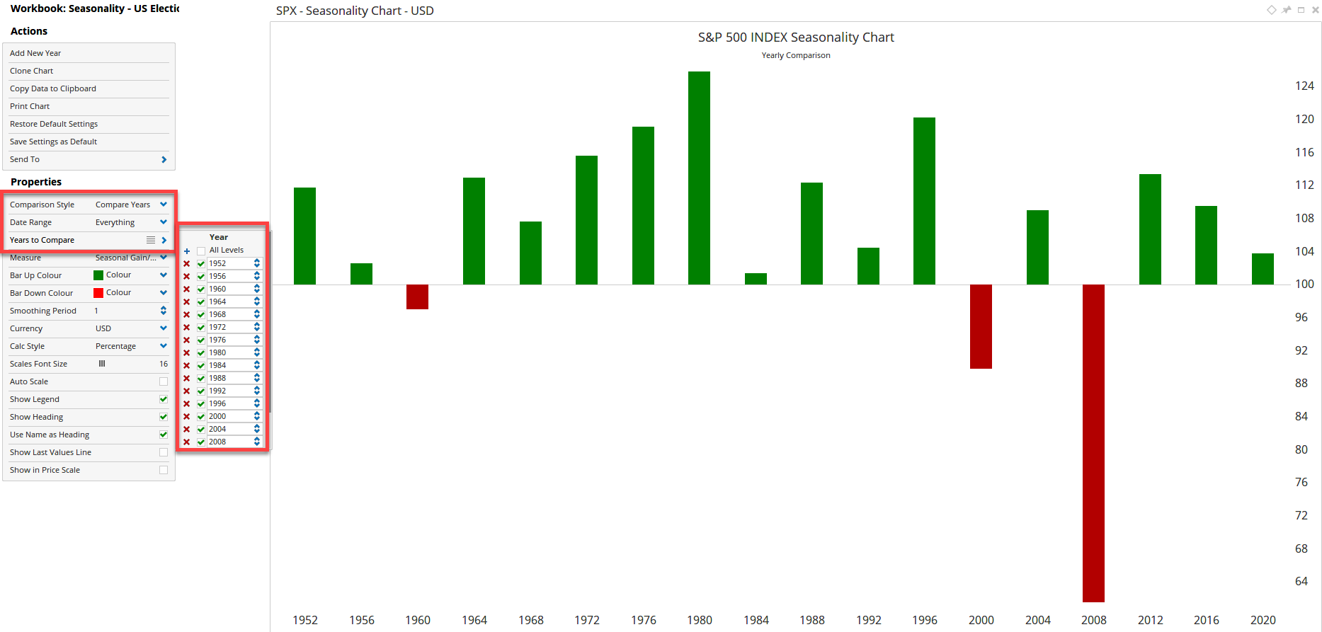
By changing the Comparison Style property of the Seasonality chart to Compare Years you can enter the years of the US Elections. Here’s the S&P500 index showing annual performance since 1952 (note the workbook can be downloaded from the link below).
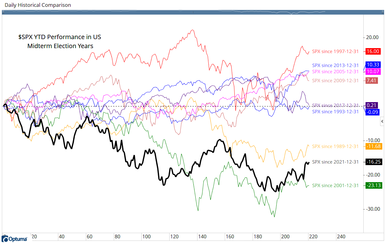
Thanks John - it’s not possible to show the average of the Historical Comparison chart at this time, but this has been logged for inclusion in a future update.