Hello group,
Now that total return data is available, is it possible to construct charts such as the following?
This is showing AT&T’s price % return vs the total return %
I’m not sure how to activate total return in a historical comparison chart
Hello group,
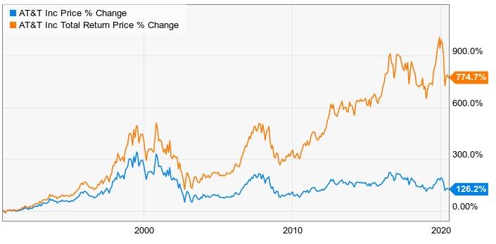
Now that total return data is available, is it possible to construct charts such as the following?
This is showing AT&T’s price % return vs the total return %
I’m not sure how to activate total return in a historical comparison chart