I did a custom script for a column chart to see monthly performance of sectors.
But, I would like greater than 0 to be green, and below 0 to be red.
CHANGE(month(PERIODAMOUNT=1), INT_TYPE=Bars, INT_COUNT=1) is the script I used.
How do I add colors to this?
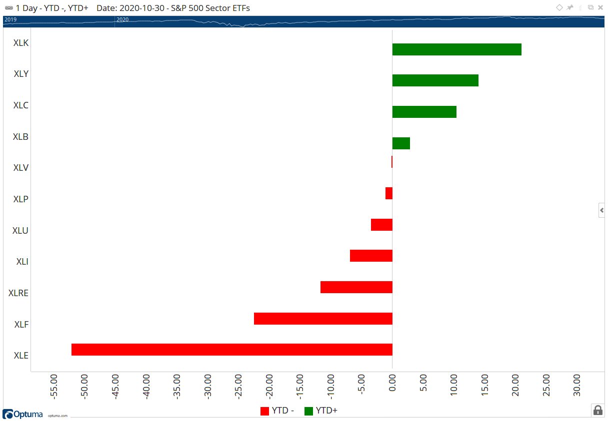
Thanks Matt. In column charts the colours can only be changed for separate scripts. So in this case you would have to add two scripts - one for positive and one for negative, as per this example for YTD% (workbook attached):