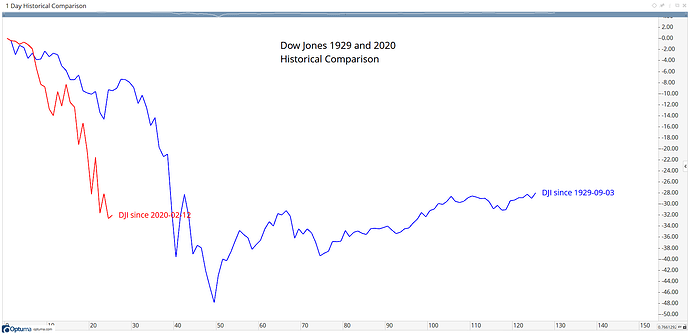
As seen in Mathew’s blog post, the Historical Comparison chart is a great way to compare time periods and help to determine cycles. Here’s another example comparing the current situation in the Dow Jones index to that of 1929. The blue line is 6 months from the 1929 high, with the red line from Feb 12th:
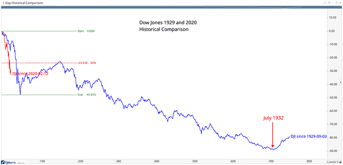
As you can see it’s fallen quicker this year and has yet to find a bottom, which was found after 50 trading days in 1929. However, if you expand the chart out 3 years it shows the 50% retracement from the 1929 low before resuming the downtrend before the bottom is finally reached in July 1932:
Optuma clients can save the workbook attached to open the chart themselves.
DJI-Historical-Comparison.owb (7.2 KB)

