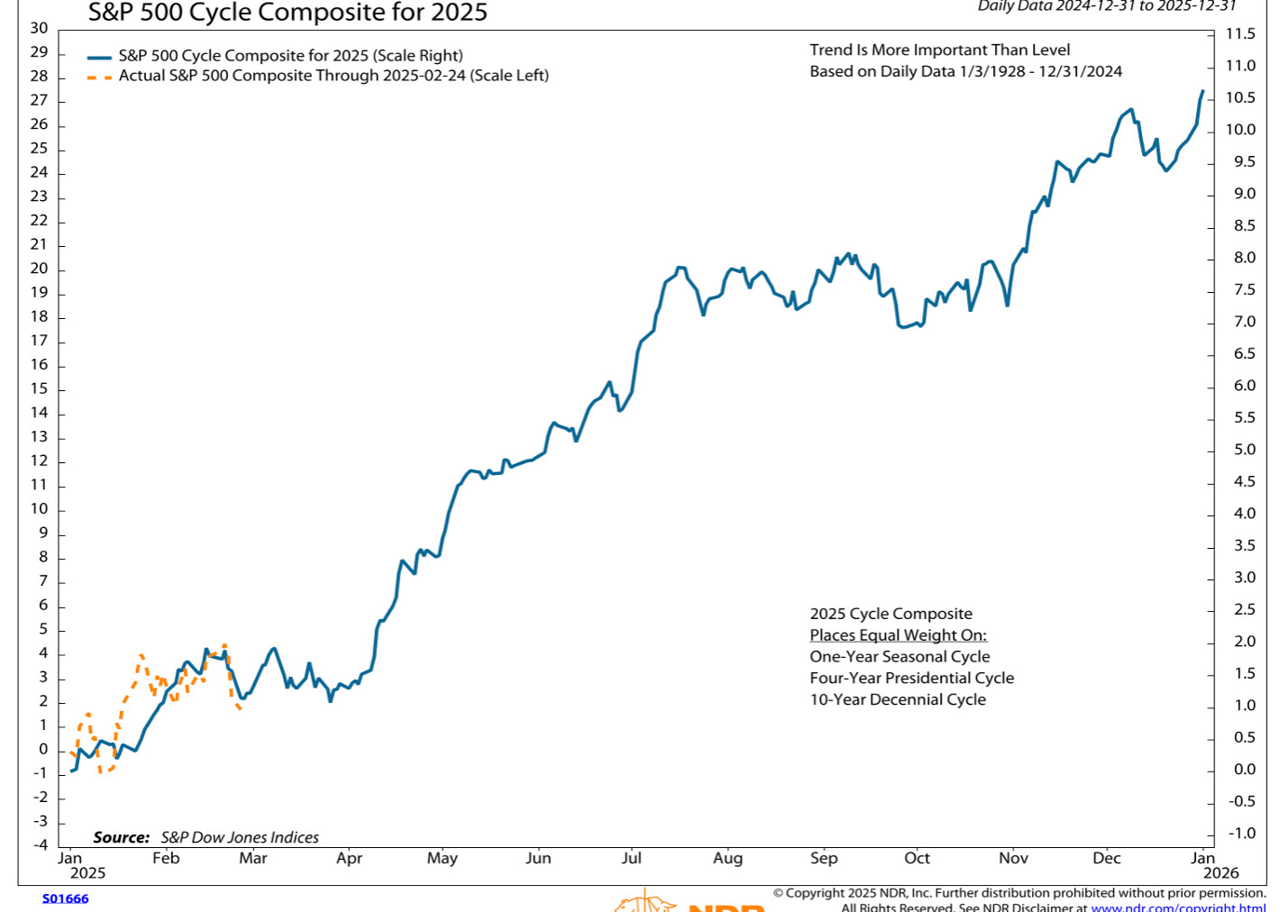
Is it possible to create a line based seasonality chart like the below in Optuma?
The example scripts I have seen usually show a single year or monthly comparison on a bar chart, but not something quite like this. Would something similar be possible?
You can create this type of chart using the Signal Tester and creating a formula, although can’t combine the 3 cycles in the example.
For example, the average year in the S&P500 can be calculated using YEARNUM() IsUp as the trigger, and taking the close of the day before (ie the last day of the previous year) with 252 trading days after:
V1=YEARNUM() IsUp;
//Offset to the day before to get the previous year close;
V1[-1]
// Change in year
m1 = YEARNUM() IsUp ;
//Use MOD, 10 to get the year, eg all years ending in 5;
y1 = Mod(YEARNUM() - 1900, VALUE=10) == 5;
S1= m1 and y1;
//Previous year close;
S1[-1]
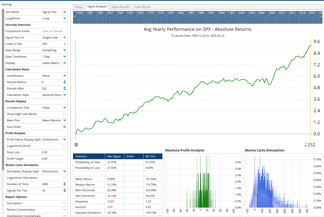
Average year ending in 5 for DJI (not including this year):