Hi Sir
There is a small mismatch from dates i am seeing from somewhere else for fed rate cut.
Hi Darren,
Twitter now X sends its greetings once again.
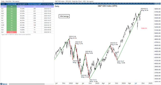
You have published an interesting swing watchlist on X. Here is the link and the chart:
My request is once again whether you can publish the watchlist here in the forum or the scripts for the columns in the watchlist.
Thank you again for your great suggestions and support.
Thomas
Hi Thomas,
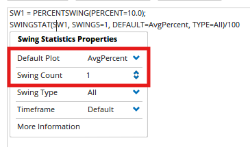
The Swing Length % column uses the SWINGSTAT function set to AvgPercent for 1 swing (ie the current swing):
SW1 = PERCENTSWING(PERCENT=10.0);
SWINGSTAT(SW1, SWINGS=1, DEFAULT=AvgPercent, TYPE=All)/100
Workbook attached for the all the columns.
10PctSwings.owb (33.3 KB)
Hi Darren,
Nice to have you back.
We have missed you in the last few weeks. I hope you are well and hopefully you had a relaxing and certainly well-deserved vacation.
Thank you very much for the swing workbook.
Thomas
Hi Darren,
Once more again you have published on X an interesting chart about the S&P 500 breadth performance.
Here is the link: x.com
Here is the chart:
As always my question: Can you publish the scripts for the chart?
Thank you very much.
Thomas
Hi Thomas,
The blue Show Bar lines are when there have been more daily advances than declines for 6 straight days:
//Get $SPX breadth data;
D1=GETDATA(CODE=SPX-AD.OB:BD);
// Show when 6 days since SPX-AD has been -ve;
TIMESINCESIGNAL(D1<0) ==6;
The green Show View histogram show the counts (change the last line to D1>0 to see the red histogram).
//Get $SPX breadth data;
D1=GETDATA(CODE=SPX-AD.OB:BD);
// Show when 6 days since SPX-AD has been -ve;
TIMESINCESIGNAL(D1<0);
Hi Darren,
Thanks again for your help. I tried to get the same diagram as yours, but I did not succeed.
My problem was that I didn’t get the idea of using the TIMESINCESIGNAL function in the way you did.
OK. Save and open the attached workbook and see how it looks.
AdvDecCounts.owb (28.1 KB)
Thanks Darren, but I was already able to create the chart using your scripts.
Hi Darren,
The story continues. Can you please show here in the forum the scripts or even better the workbook with the scripts of your new chart you published on X about the drawdown performance?
https://x.com/Optuma/status/1922621413971927526
There seems to be something wrong with the numbers 1677, 1604, and 1275. Or am I wrong?
Thanks,
Thomas
Thanks Thomas. Ah yes the histogram is correct but the red and green lines were using 3 year highs, not all-time highs. Here’s the formula for the histogram:
//Set the Drawdown signal;
V1 = DDP(BACKTYPE=All Time) CrossesBelow -20;
//New high signal;
V2 = HIGH()>=HIGHESTHIGH(RANGE=All History);
//First drawdown after new high;
V3 = SWITCH(V1,V2) ChangeTo 1;
//First new high after drawdown;
V4 = SWITCH(V2,V1) ChangeTo 1;
//Calculate difference in BarIndex values;
V5 = VALUEWHEN(BARINDEX(),V4) - VALUEWHEN(BARINDEX(),V3);
If(V4, V5, MISSING())