Twitter Charts

I’ve created this thread for some of the charts that are posted on our Twitter account. If there are any you would like to see post the request and Tweet link in a reply.

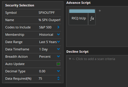
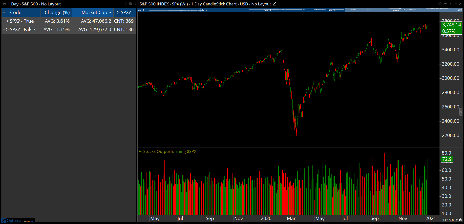
I’ll start with this one that uses the custom Market Breadth module to calculate the daily percentage of stocks in the S&P500 that outperform the index. As the S&P500 is a market cap weighted index the largest companies have a bigger impact on performance. So when the number of companies outperforming the index is low its the big guys doing the work, whereas if 73% are outperforming then performance will be skewed to the smaller caps.

To build the breadth measure use this simple Relative Index Comparison function:

RIC() IsUp

This will count the number of stocks whose relative performance is higher than the previous bar. If true, then it has outperformed the index on that day and is given a value of 1. The breadth engine will then calculate the percentage of true results for each day to build the data. For accuracy, use the Historical Membership if running on the S&P500 so that only stocks that were in the index at the time are included.

Capture

Once the breadth data has been built (this example created a ticker symbol SPXOUTPF) then it should display when you open the attached workbook. The Watchlist will load the latest data for the S&P500 stocks and put them into true/false groups. If you have our Fundamental Data on your account then it will also calculate the average market cap size of each group for that day’s trading.

Download and save the workbook top open the chart (if you don’t have the Market Breadth module then the lower panel will be blank).

Pct-SPX-members-outperform.owb (210 KB)

Automated Fibonacci levels: https://twitter.com/Optuma/status/1351881460156809217?s=20

The script will calculate the high/low range between January 1st and May 1st 2020, and then plot the 138.2% and 161.8% levels:

//Set Hi/Low date period;
H52 = HIGHESTHIGH(RANGE=Range, RANGESTART=2020-01-01, RANGEEND=2020-02-29);
L52 = LOWESTLOW(RANGE=Range, RANGESTART=2020-03-01, RANGEEND=2020-05-01);
//Calculate Hi-Low range;
R1=(H52-L52);
//Plot levels;
Plot1=LAST(L52);
Plot2=LAST(H52);
Plot3=LAST(L52+(R1*1.382));
Plot4=LAST(L52+(R1*1.618));

The Show View below the chart plots the retracement levels:

//Set Hi/Low date period;
H52 = HIGHESTHIGH(RANGE=Range, RANGESTART=2020-01-01, RANGEEND=2020-02-29);
L52 = LOWESTLOW(RANGE=Range, RANGESTART=2020-03-01, RANGEEND=2020-05-01);
//Calculate Hi-Low range;
R1=(H52-L52);
//Calculate retracement;
R2 = CLOSE()-L52;
R2/R1 * 100

Retracements-1.owb (50.1 KB)

TimeSinceSignal scripts: https://twitter.com/Optuma/status/1359122061592039428

Days since RSI below 50:

TIMESINCESIGNAL(RSI(BARS=14)<50)

Weeks since being on the left side of the RRG (on weekly watchlist - requires RRG Pro module):

V1=JDKRS().Ratio<100;
TIMESINCESIGNAL(V1)

TimeSinceSignal-1.owb (64.9 KB)

Hi Darren,

als always thank you very much for your post and especially workbook.

One last question: Can you post the code for the column “Date since” you have in the watchlist in your Twitter chart?

Thanks,
Thomas

Date Since RSI(14) was last below 50:

V1=TIMESINCESIGNAL(RSI(BARS=14)<50, UNIT=Days);
LAST(BARDATE())-V1

This will display as a number, so right-click on the watchlist column heading and change the Column Type to Date.

More examples here: https://forum.optuma.com/topic/using-bardate-to-display-when-a-condition-last-happened/

Stats on stocks joining the S&P500 index

https://twitter.com/Optuma/status/1362792200778772486?s=20

Workbook with scripts attached.

SPX-Members.owb (37.6 KB)

VIX curve chart (requires access to the CBOE Indices data).

https://twitter.com/Optuma/status/1381926511024934912?s=20

VIX-Indices.owb (40.4 KB)

RSI Switch: https://twitter.com/Optuma/status/1389914639211929604

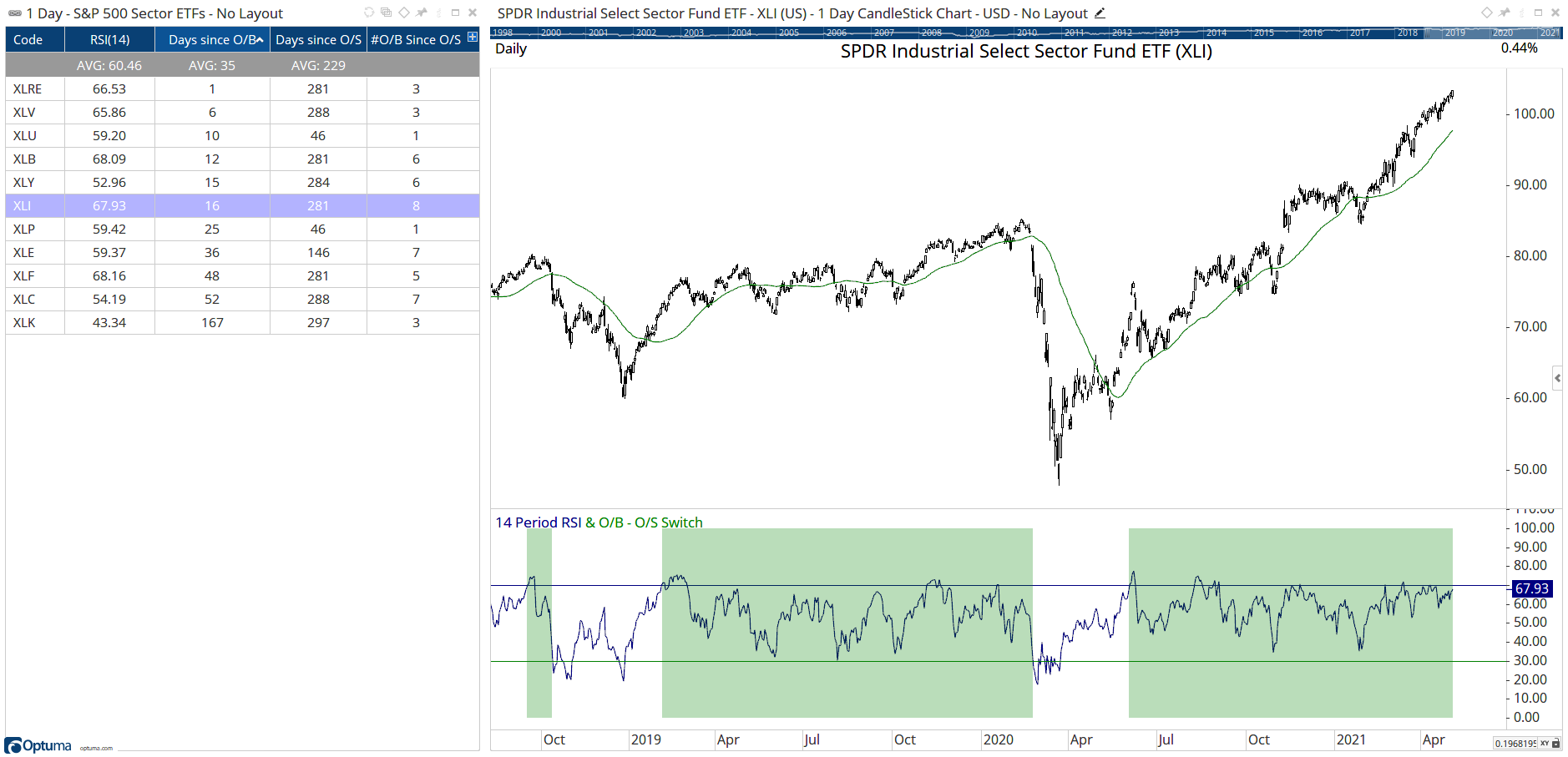
This uses the Switch function to signal when the RSI crosses above 70 and remain true until it crosses below 30, as seen in the green shaded area (created in a Show View dragged over the RSI).

SWITCH(RSI(BARS=14)>70, RSI(BARS=14)<30)

Days since Overbought:

V1 = RSI(BARS=14)>70;
TIMESINCESIGNAL(V1)

Number of Overbought conditions since the last Oversold:

//Create 2 Boolean conditions
V1 = RSI(BARS=14) CrossesAbove 70;
V2 = RSI(BARS=14) CrossesBelow 30;
//Count the number of times V1 occurred since V2
COUNTMATCHSINCESIGNAL(V1,V2)

RSI-Switch.owb (36.6 KB)

https://mobile.twitter.com/Optuma/status/1386638124466507778

Hiii sir

Can u tell how this test was done.

Regards

Deepak

Use this on weekly timeframe for when the 1 bar stochastic is below 10:

STOCH(BAR1=1, BAR2=1)<10

To count the number of higher swing lows since the last lower swing low: https://twitter.com/Optuma/status/1399700048829616134

The script uses the following functions with a Gann Swing in a Show View:

SwingTrendUp and SwingTrendDown: https://help.optuma.com/kb/faq.php?id=1225

CountMatchSinceSignal: https://help.optuma.com/kb/faq.php?id=962

//Define Swings;
GS1 = GANNSWING(SWINGCOUNT=3, METHOD=Use Next Bar, USEINSIDE=True);
//SwingTrend is Up;
R1 = SWINGTRENDUP(GS1) == 1;
//Swing direction changes to up when trend is Up;
R2 = SWINGUP(GS1) ChangeTo 1 and R1;
//Lower swing low when trend is down;
R3 = SWINGTRENDDOWN(GS1) == 1;
//Count how many occurrences of R2 since R3 (not incl initial low swing);
COUNTMATCHSINCESIGNAL(R2, R3) - 1

SPX-Swing-Count.owb (13.1 KB)

Advancing volume %: https://twitter.com/Optuma/status/1417809118631452674?s=20

The example in the Tweet was using IQFeed data (VINA.Z / VINT.Z) but the same can be calculated using our Breadth Measures data. This example is for SPX, which can be used in a Show View set to histogram:

ADV = GETDATA(CODE=AVVSPX:BM);
DEC = GETDATA(CODE=DVCSPX:BM);
ADV/(ADV+DEC)*100

This can then be used in a Show Bar to highlight when the day’s value is > 80% or < 20%. The following combines the two to show when an >80% day follows a <20% day:

ADV = GETDATA(CODE=AVVSPX:BM);
DEC = GETDATA(CODE=DVCSPX:BM);
V1 = ADV/(ADV+DEC)*100;
R1 = V1>80;
R2 = V1<20;
//Is today > 80 and yesterday < 20?
R1 and R2[1]

% change from COVID lows: https://twitter.com/Optuma/status/1425791260263165956

// Get lowest low from date range;
L52 = LOWESTLOW(RANGE=Range, RANGESTART=2020-03-01, RANGEEND=2020-05-01);
//Calculate % Change;
(CLOSE() - L52)/L52

Show Plots for the low and 2 x low:

// Get lowest low from date range;
L52 = LOWESTLOW(RANGE=Range, RANGESTART=2020-03-01, RANGEEND=2020-05-01);
// Plot the low;
Plot1 = LAST(L52);
Plot1.Colour = Red;
Plot1.Linestyle = Dash;
// 2 x Low;
Plot2 = LAST(L52) * 2;
Plot2.Colour = Blue;
Plot2.Linestyle = Dash;
// Repeat for any other levels, eg 2.618, 3, etc;

COVID-Lows.owb (36.9 KB)

Number of new all-time highs in 2021: https://twitter.com/Optuma/status/1427600292502294557?s=20

//Get new all-time highs;
V1 = HIGH()>=HIGHESTHIGH(RANGE=All History);
//Sum true conditions;
ACC(V1,RANGE=Look Back Period, BACKTYPE=Date, STARTDATE=2020-12-31)
Time since last ATH:
V1 = HIGH()>=HIGHESTHIGH(RANGE=All History);
TIMESINCESIGNAL(V1)
New ATHs in the last 10 days:
V1 = HIGH()>=HIGHESTHIGH(RANGE=All History);
BARSTRUE(V1, LOOKBACK=10)

New-ATHs-in-2021.owb (41.6 KB)

SPX outperformance: https://twitter.com/Optuma/status/1432685094788009990?s=20

These measures were built using the Custom Breadth module on historical members:

Daily % outperforming the index:

RIC() IsUp

% Outperforming SPX YTD (Start Date of calculation Jan 4th 2021):

RIC(DATESEL=User Defined, START_DATE=2020-12-31, ZEROBASED=True) > 0 

September 20th Gap in the $SPX: https://twitter.com/Optuma/status/1440999242319945731?s=20

This script can be used to show if there was a gap greater than 0.5% from the low on Friday 17th:

//Set Gap Low Date;
LowDate = BARDATE()==STRDATE(DATE=2021-09-17);
//Set Gap High Date;
GapDate = BARDATE()==STRDATE(DATE=2021-09-20);
//Get High / Low values for those days;
FriLow = VALUEWHEN(LOW(),LowDate);
MonHi = VALUEWHEN(HIGH(),GapDate);
//Was there a 0.5% gap down?
MonHi < FriLow * 0.995

To find if the gap has been filled add this to the last line:

and HIGHESTHIGH(RANGE=Range, RANGESTART=2021-09-20) > FriLow

As of Thursday 23rd, 128 of the 150 gaps had been closed.

The Lowest Close Since formula used in this Tweet can be found here: https://forum.optuma.com/topic/timesincesignal-formulas/#post-51863

To show the ‘Worst Daily Loss Since’ date in a watchlist:

//Set Column Type to Date format in watchlist; 
D1=LAST(ROC(BARS=1)); 
BARDATE(ROC(BARS=1)<D1)

Best Daily Gain Since:

//Set Column Type to Date format in watchlist;
D1=LAST(ROC(BARS=1));
BARDATE(ROC(BARS=1)>D1)

Capture

Market Cap time series data comparing biggest US companies: https://twitter.com/Optuma/status/1452923394945601538?s=20

This was created using a Script Chart: https://help.optuma.com/kb/faq.php?id=951

You must have our Fundamental Data enabled to use the script:

DATAFIELD(FEED=FD, FIELD=MarketCapitalization, LATESTONLY=False) / 1000

Swing scan for change in trend: https://twitter.com/Optuma/status/1456224982028148748?s=20

The Tweet was based on a 3 bar Gann Swing, but it can be applied to a Percent or Volatility Swing (simply change the S1 variable which will then be used by the SWINGTRENDUP and SWINGTRENDDOWN functions).

//Define swing;
S1 = GANNSWING(SWINGCOUNT=3, METHOD=Use Next Bar, USEINSIDE=True);
SWINGTRENDUP(S1) ChangeTo 1 or
SWINGTRENDDOWN(S1) ChangeTo 1

FDWMaRUX0AMmU_k

Would you please post the script to calculate the number of all-time high closes by year from this post? https://twitter.com/Optuma/status/1458029600282398724

TIA!