Hello Optuma Support,
I would like to be able to scan for stocks on say ASX100 that seasonally have historically risen by a selected amount ie more than 5% over the next selected period ie 1 month, for say more than 50% of the time for that selected 1 month period (lets say April) in the past for the life of that stock.
Seasonality doesn’t appear to have a scripting function, I have searched the forum and tried the AI assistant but not found what I am looking for.
I borrowed and then modified the base script from -Seasonality Charts - one of the many script mods I have tried is as per following -
M1 = MONTHNUM() == mo;
mo=(1 or 2 or 3 or 4 or 5 or 6 or 7 or 8 or 9 or 10 or ll or 12); // same result as below?
//mo=(1 and 2 and 3 and 4 and 5 and 6 and 7 and 8 and 9 and 10 and 11 and 12);
acc1=ACC(mo);
M2 = CHANGE(INT_TYPE=Month);
acc2=ACC(M2);
IF(M1 == acc1,acc2,acc1) * 1/100
I have been unable to make this work as intended.
My idea was to display this at the bottom of the chart as an indicator, display results in a watchlist and use in scans/backtests.
Any help would be greatly appreciated,
Thanks, Brad
Hi Brad,
I can’t think of a way to easily do everything you require, but the formula below will calculate the average April performance (you would have to have a separate formula for each month).
//Select month, eg April = 4;
M1 = MONTHNUM() == 4;
//Calculate the monthly change;
M2 = CHANGE(INT_TYPE=Month);
//If M1 is true plot M2, else plot 0;
R1=IF(M1 == 1,M2,0);
//Sum all returns;
S1=ACC(R1);
//Count number of months;
S2=COUNTMATCH(BARS=5000,R1<>0);
//Calculate avg monthly return > 5%;
(S1/S2)>5
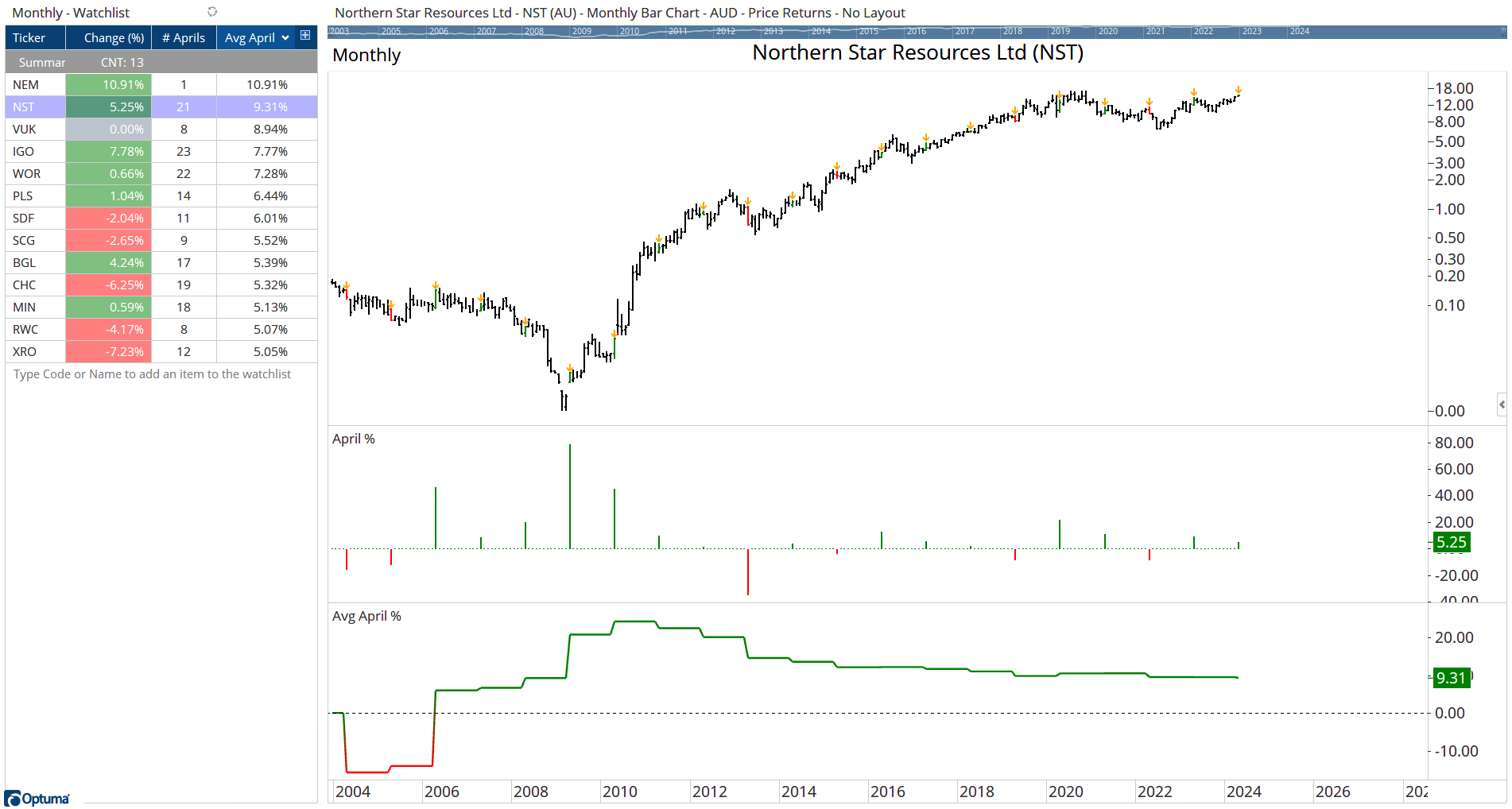
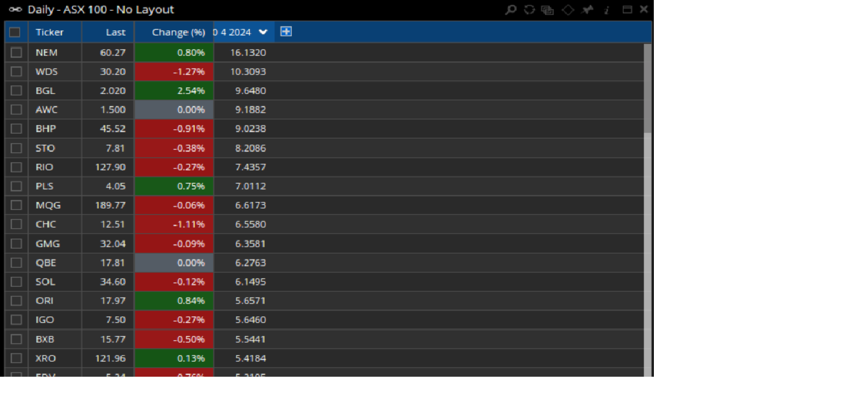
There are currently 13 stocks in the ASX 100 that average > 5% every April (but note that this is the first April for NEM). NST has averaged 9.31% in April for the last 21 years (currently 5.25% this year), but this has been skewed by a 78% gain in 2009.
Hopefully this will help you get started, but if you would like us to spend more time as part of a consulting project please contact Support.
note - I am not sure if these screen shots downloaded correctly, are you able to view them?.
Thank you Darren, I have been trying to work out how you did this.
-how did you generate this watchlist with only 13 tickers from the ASX100, my NST is well down the list at 3.1950.
-how did you generate the April% indicator - what does each vertical line mean?
I think I can do Avg April% indicator line using Plot1=(S1/S2) → Plot1 Style - Color Scheme=Positive/Negative, is this correct?
-each indicator line flat level appears to last for 12 months - what does the Avg April% actually mean?
Thanks again for your help,
Brad
Hi Brad,
See below:
-how did you generate this watchlist with only 13 tickers from the ASX100, my NST is well down the list at 3.1950.
The watchlist and chart needs to be in a monthly timeframe to calculate the averages.
-how did you generate the April% indicator - what does each vertical line mean?
That’s the performance of each April calculated by this formula, so in April 2023 NST was +9.34%, and is currently +5.74%.
I think I can do Avg April% indicator line using Plot1=(S1/S2) → Plot1 Style - Color Scheme=Positive/Negative, is this correct?
Correct - or just click on the Avg April % column heading and drag it in to the chart.
-each indicator line flat level appears to last for 12 months - what does the Avg April% actually mean?
It’s a timeseries of each April’s average return, and will only change after each April. If that year’s April is above average then the line will move up, or down if it’s below average.
In this example, the average April return for all years up to 2024 was 2.25%, but because the current April is -1.38% then the line has fallen to 2.14%. This figure will change every day until the end of the month, and then it will remain flat until next April.