Hi Brad,
See below:
-how did you generate this watchlist with only 13 tickers from the ASX100, my NST is well down the list at 3.1950.
The watchlist and chart needs to be in a monthly timeframe to calculate the averages.
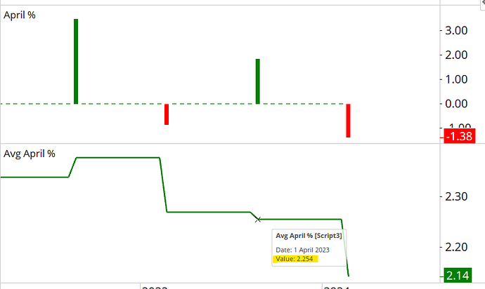
-how did you generate the April% indicator - what does each vertical line mean?
That’s the performance of each April calculated by this formula, so in April 2023 NST was +9.34%, and is currently +5.74%.
I think I can do Avg April% indicator line using Plot1=(S1/S2) → Plot1 Style - Color Scheme=Positive/Negative, is this correct?
Correct - or just click on the Avg April % column heading and drag it in to the chart.
-each indicator line flat level appears to last for 12 months - what does the Avg April% actually mean?
It’s a timeseries of each April’s average return, and will only change after each April. If that year’s April is above average then the line will move up, or down if it’s below average.
In this example, the average April return for all years up to 2024 was 2.25%, but because the current April is -1.38% then the line has fallen to 2.14%. This figure will change every day until the end of the month, and then it will remain flat until next April.
