The DAYOFWEEK() function assigns a value to each week day, with Sundays assigned a 1, Mondays = 2, etc. As such, to mark all Fridays on a chart use DAYOFWEEK()==6 in a Show Bar. This will show all Fridays with a fall greater than 3%:
//Display as Date in Watchlist;
//Get the last 1D ROC change %;
D1=LAST(ROC(BARS=1));
//Get the BarDate when the 1D ROC was less than D1;
BARDATE(ROC(BARS=1)<D1, UNIT=Days)
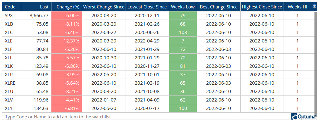
Lowest Close Since:
//Display as Date in Watchlist;
//Get the last close price;
D1=LAST(CLOSE());
//Get the BarDate when the Close was less than D1;
BARDATE(CLOSE()<D1)
Weeks Since Low
//Get the last close price;
D1=LAST(CLOSE());
//Get the time since the Close was less than D1;
TIMESINCESIGNAL(CLOSE()<D1, Unit=Weeks)
To find the high dates instead, change the < to >. Sample weekly watchlist attached that can be saved as a layout and applied to any other lists.
The pre-Covid high values were defined using the HIGHESTHIGH function between January 1st and March 13th 2020, and getting the percent difference from the latest close:
With this script I get the maximum drawdown for the SPX of -24.52%, in your chart you have for the maximum drawdown a value of -23.69%.
What is the reason for this difference?
I have figured out how you have calculated the maximum intra-year drawdowns. You calculate the percentage difference between the closing price of the previous year and the lowest low of the next year.
OK so far so good, but this is not the “real” maximum intra-year drawdown. A better naming would be helpful e.g. maximum drawdown between the closing price of the previous year and the lowest low of the next year.
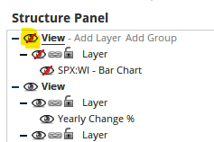
It has been created using a Show View below a yearly price chart, and the price chart ‘view’ hidden in the Structure Panel.
The Show View formula set to display as a histogram is simply CHANGE() for the columns (as the chart is a yearly timeframe it will calculate yearly change).
Max intra-year low is a Show Plot for the blue line:
This time making it short: "Can you publish here in the forum the scripts for the chart and backtest of your Twitter analysis about “$SPX losing 2% on a Monday following a 1% loss on a Friday”?